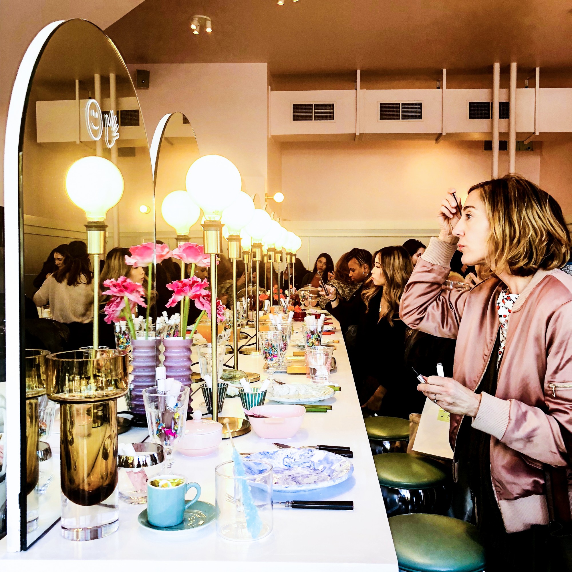
Two weeks ago, Glossier’s SF pop up shop shut its millennial pink doors. The concept might have looked like an odd pairing: minimalist beauty products sold alongside buttermilk fried chicken sandwiches at Rhea’s Cafe.
But the experience was so expertly branded that the pairing seemed perfect. And customers ate it up—the pop up reportedly resulted in a Glossier purchase every 20 seconds.
Let’s look at Glossier’s pop up through the lens of User Experience Design to see (1) what they did to get it so right and (2) how you can replicate their “rightness” for any industry or platform, be it an IRL interaction or a digitally-driven purchase funnel.
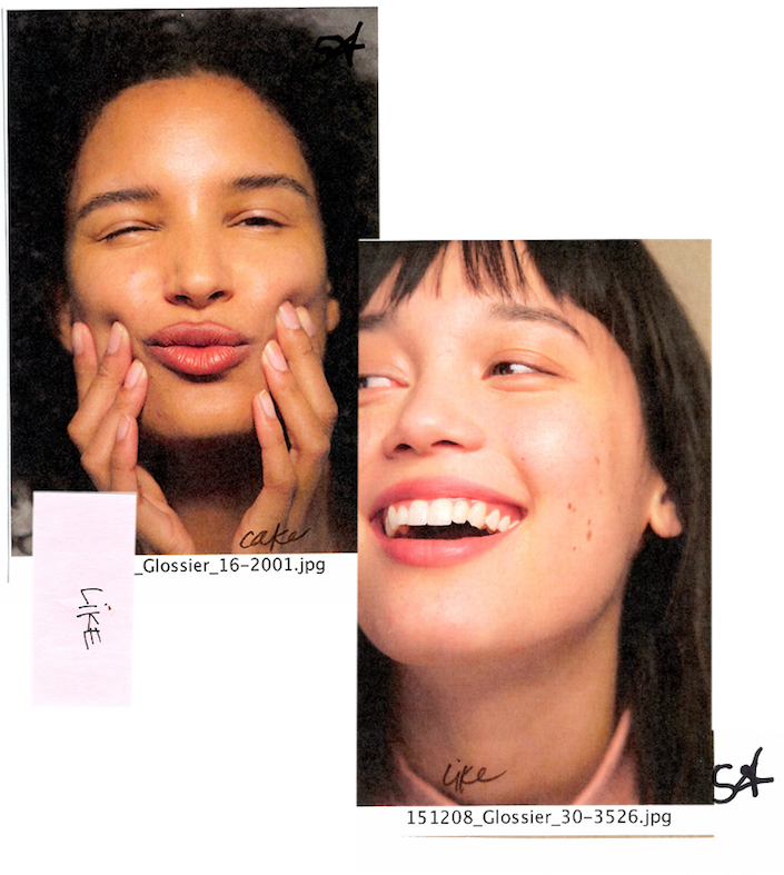
The User Experience (UX) Design Lens
Don Norman, the inventor of the term Use Experience Design, said “No product is an island. It is a cohesive, integrated set of experiences.”
Whether you’re selling a lip gloss, a car or even a data solution, you need to analyze all of the stages and interactions that surround your product and make sure they’re part of a seamless story.
UX Consideration #1: The Why
Before Glossier started on creative concepts for the SF pop-up, they had a firm grasp on the two main elements of their brand’s “why.”
1. Why #1: The User’s Motivations for Buying the Product The Glossier Girl is a beauty minimalist who shops with her heart. She wants to look good, not spend a crazy amount of time on her appearance and be her own beauty expert.
2. Why #2: The Values and Views Associated with Ownership of the Product The Glossier Girl celebrates her individuality. She’s not trying to cover up her flaws, because they make her unique. She likes brands that are open, real, honest, playful and willing to experiment—brands that are like her.
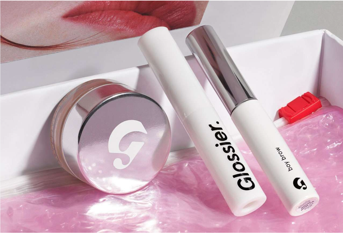
UX Consideration #2: The What
Since Glossier was born from a popular beauty blog, they already had an interactive fanbase. Glossier has fostered and grown these relationships in ways that have become the gold standard for customer engagement, most notably as they develop their products.
The “What” in UX refers to the functionality and features features of the product. In the case of Glossier, the products are all:
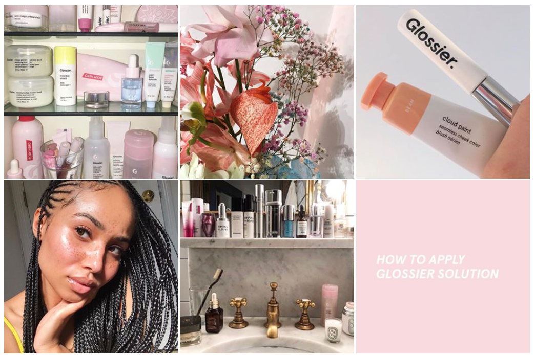
UX Consideration #3: The How
In user experience design, the How refers to the design of functionality in an accessible and aesthetically pleasant way. Here’s where the genius of Glossier’s pop up store shines.
Find Your Big Three
Like writing, the “How” of a brand experiences can abide by The Rule of Three: a principle that a trio is more effective than other numbers in execution of a story and in engaging a reader.
Every brand should focus on what I call “The Big 3”—the 3 core elements of the brand that need to be integrated into every user experience to make the brand connect.
Based on their Why and their What, I would say that Glossier’s Big 3 are “Simple” “Fun” and “Personal.” And they ensure all three of these elements are always in play.
Turn Your Point of Entry into a Point of Opportunity
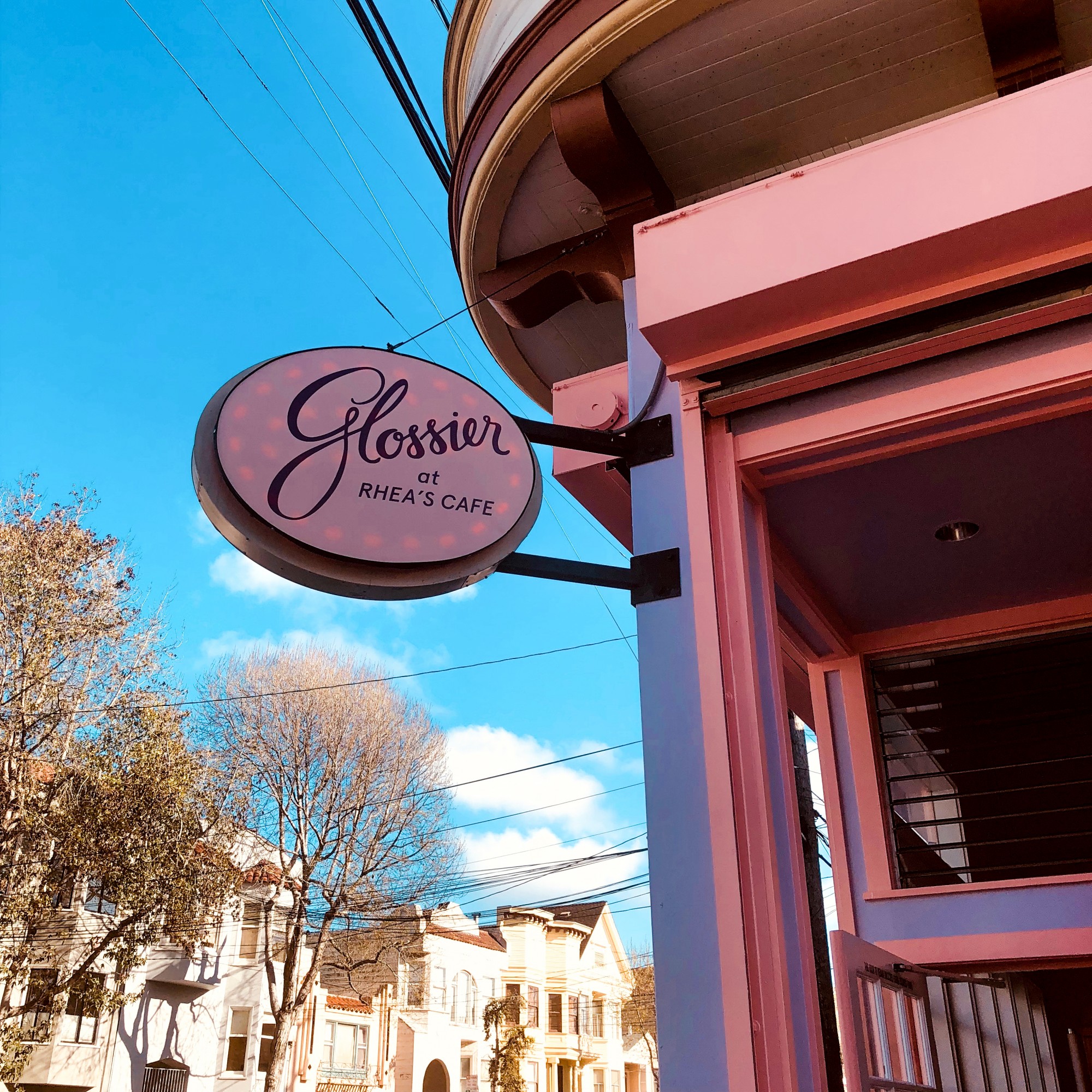
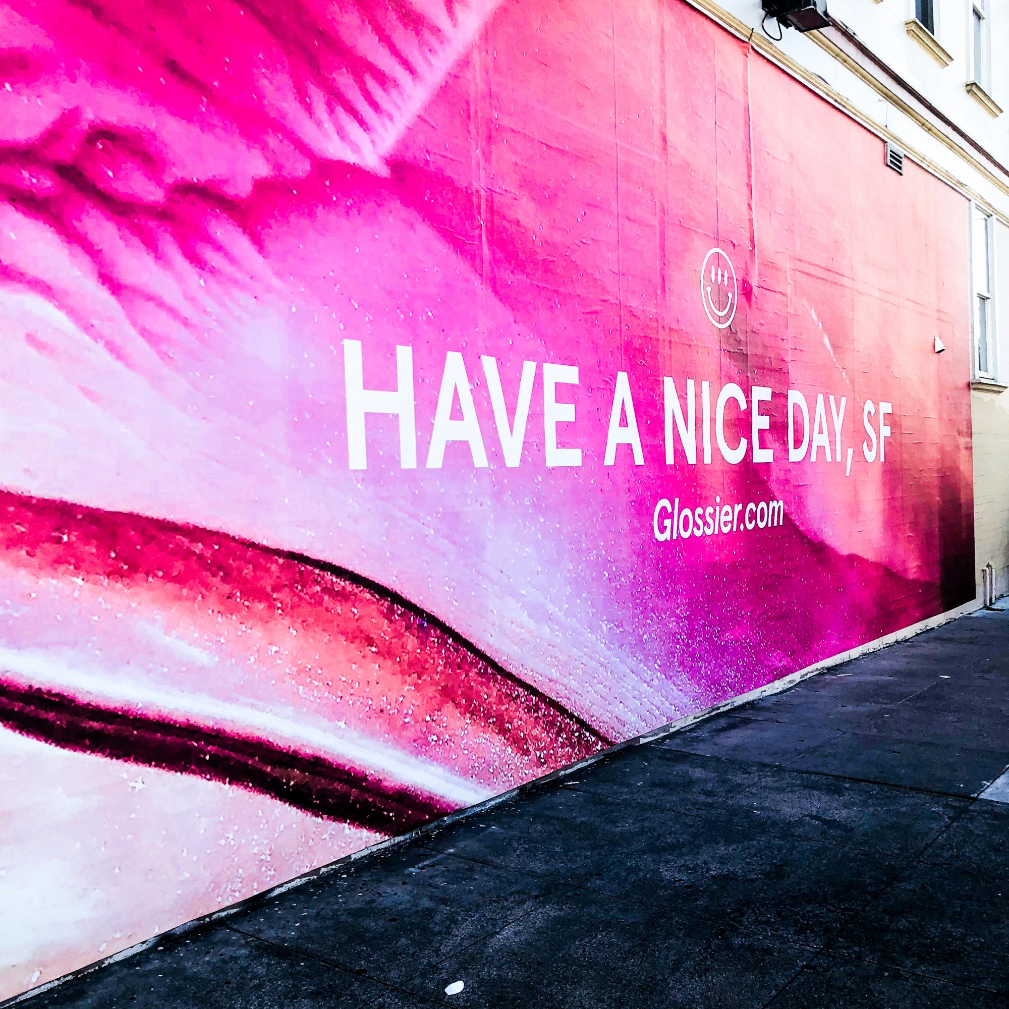
Rhea’s Cafe sits in a hip area of the Mission. Once Glossier took it over for the month, the front entrance was transformed—complete with pink and purple painted exteriors, a sign that looked retro-modern and giant Insta-magnet outdoor wall that read “Have a Nice Day, SF.”
Everything about the design was friendly, fresh and fun, inviting anyone who was curious to come inside and play.
Most days, there were lines of fresh-faced girls waiting to get inside. And this line became another opportunity for Glossier to create point-of-entry magic.
As the girls from my agency and I stood outside at 5pm on a sunny Friday, the pink-clad Glossier employee managing the entrance walked down the line carrying a bottle of the brand’s perfume, Glossier You.
“Have you tried our fragrance yet? It’s amazing,” he said, as he got all five of us to eagerly put out our wrists. “And it smells different on everyone. It works with your body’s chemistry to be totally unique to you. Try it—ok, smell each other now! See how different you all are!”
So we did. And it kind of did smell different. But whether the perfume chemically reacted with our skin in some remarkable way wasn’t the most noteworthy thing.
Glossier was taking our experience waiting in their line, turning it into a fast-learning moment about the product—AND getting us in the perfect mood to digest their brand story inside.
It was simple. It was fun. It was personal. Big Three, accomplished.
Give Your Experience the 360 Treatment
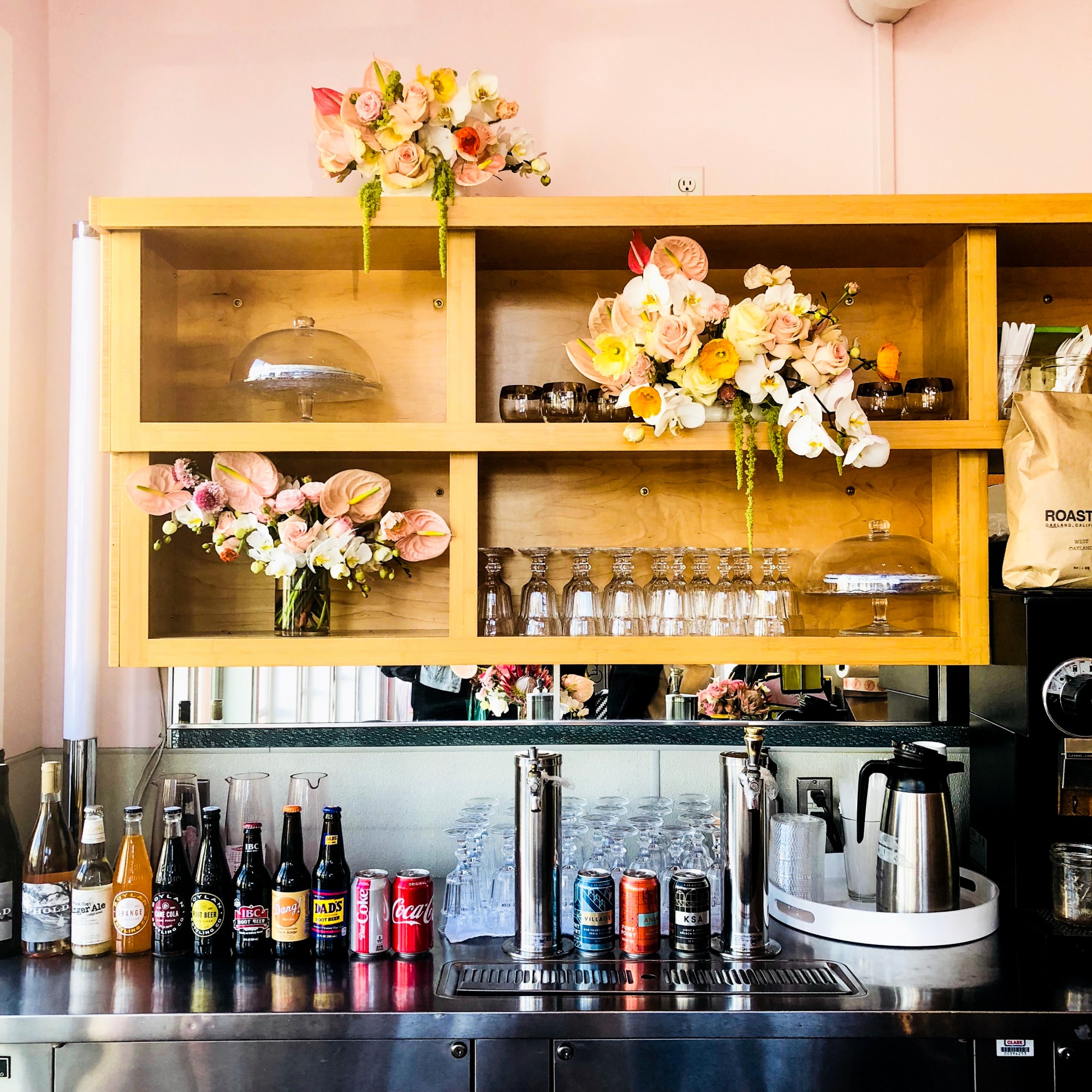
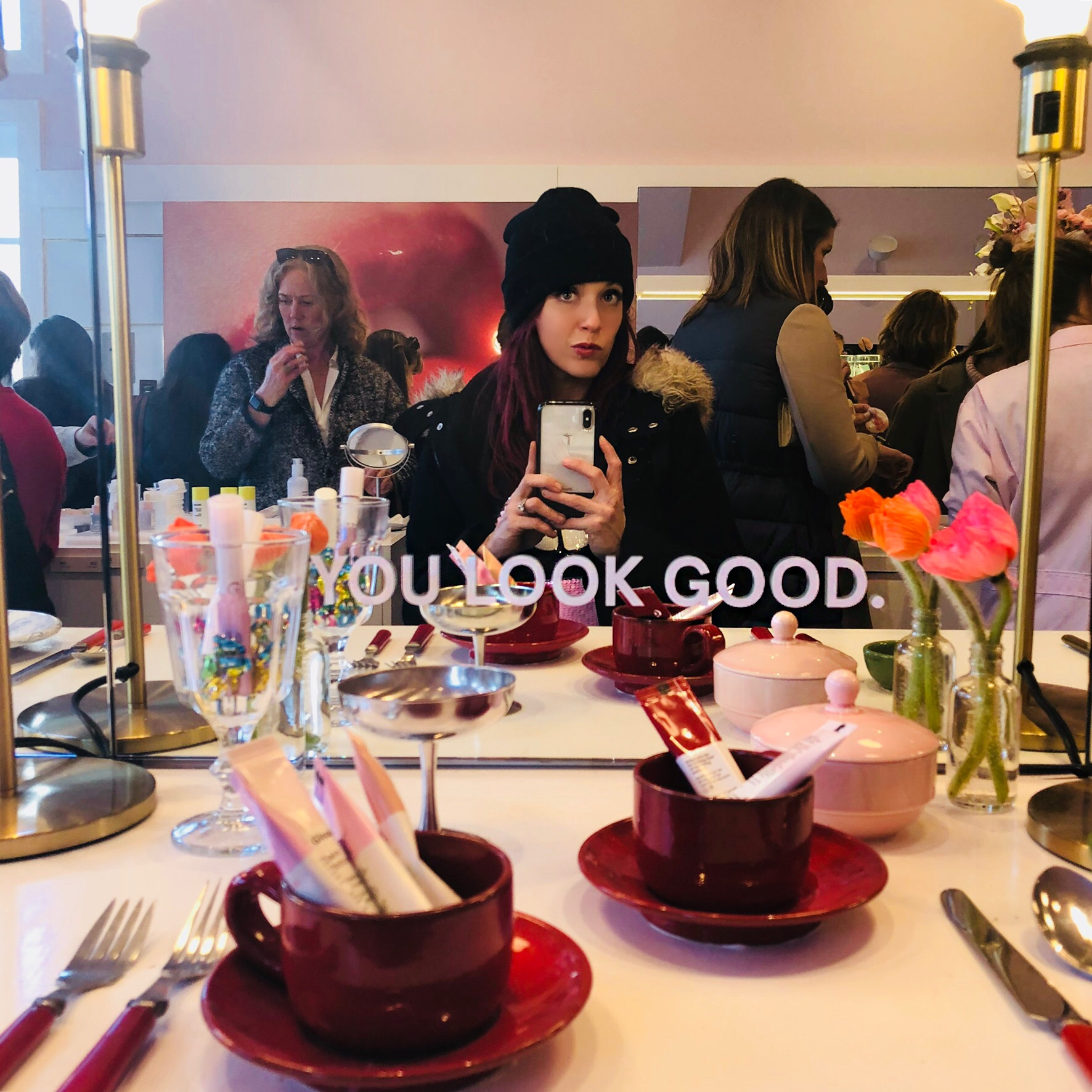
Once you entered Rhea’s Cafe, you were transported to rose-retro-diner-heaven. Everything was uniquely beautiful. Everything was oh-so Insta-friendly. And everything made you feel good about you, including mirrors that literally told you “You Look Good.”
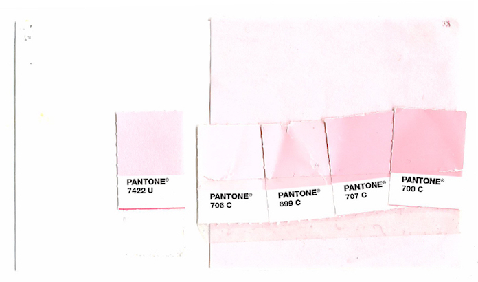
But while every detail had definitely been planned down to the Pantone, nothing felt overly designed or fussed over.
And the fact that they were also serving a limited menu of specialties at Rhea’s—like the fried chicken sandwich alongside beer and wine to sip with your shadows? It seemed perfectly natural, embracing of being and doing something differently than anyone else.
Simple? Yes. Fun. Very. And Personal? Even the mirrors were talking directly to you.
The Purchase Flow
Gaggles of girls surrounded product stations that were spread throughout the space, sampling and experimenting with all of Glossier’s offerings. More of the pink-clad employees milled about, there for questions without trying to hard sell you in any way.
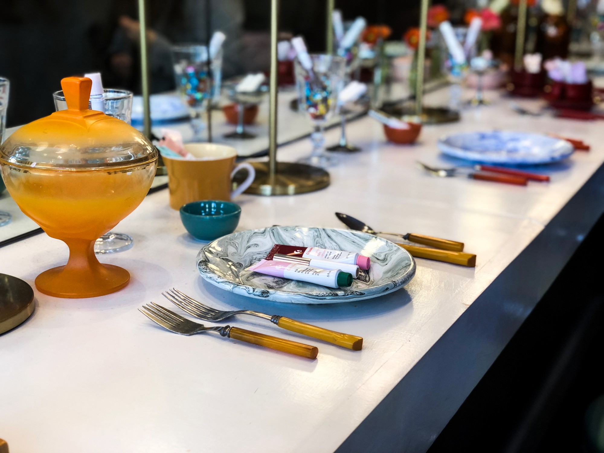
Not only was the place designed to let everyone play with the products on their faces—it was set up for photos too. All along the counter were products interspersed with diner-y elements—like glasses, plates and platters. Because photos of your beauty products are part of the fun.
Once you were sold on the product on your person and on your Insta, Glossier kept the process (you guessed it): Simple, Fun and Personal. Employees holding iPads took your order and swiped a card. When your order was ready, your name was called, and you got your pretty products in a pretty bag and Glossier’s well known pink bubble wrap. Again, the Big Three came to play at every point.
Your Insights
The Glossier brand “gets you” because they’re so close to their community. They have an incredibly strong understanding of their Why (as it relates to their customers) and their What (as it relates to their products).
Your Actions
Whether you’re a brand that leads with image or features, whether you’re selling concealer or crypto—you need to know your Why and What.
When you approach your How, pick out your Big Three elements to integrate into every detail and every interaction. Then your branding will look as good on you as it does on Glossier.
