The meteoric rise of the self care industry in recent years has meant competition is fierce when it comes to beauty products, and standing out on the shelf is a sport in itself. As a result, how each product is packaged and displayed has become just as vital as the ingredients inside the bottle.
However, prompted by the pandemic-induced lockdowns, consumers around the globe are increasingly buying online. As such, brands have had to get creative in how they spark the same emotional experiences as they would with customers in store. Instead of customers taking a little piece of a brand home with them from the shop – it’s now being delivered directly to their front doors.
This has had an incredibly interesting effect on packaging design trends across the board in 2021. As brands turned their backs on plain and commercial parcels, packaging designs have become works of art themselves in order to create memorable moments for consumers in their own homes. This phenomenon is not unfamiliar to the beauty world, which has long been a pioneer of art-inspired packaging. However, there are plenty of fresh concepts set to arrive this year.
From cult beauty buys to the newbies on the block – when it comes to 2021 packaging design trends, beauty brands are leading the charge.
1. Solid all over color
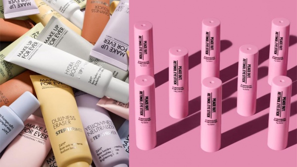
Arguably one of the biggest design trends we are seeing in the beauty industry is solid all over color. Among the more intricate designs and more clinical-looking labels, many brands have figured that this is a surefire way to evoke calm and confidence in consumers while simultaneously standing out.
Whether loud and bright or softer and muted, brands like Peace Out Skincare and Makeup Forever are choosing bold and unusual all-over color schemes to set their products apart. With brands like Tatcha, Glam Glow, and Kylie Skin also jumping in on this action, it’s unlikely that this design trend is set to go away anytime soon.

2. Hyper simplistic geometry
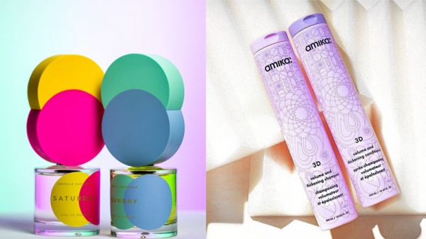
Simplicity is the theme again with another packaging design trend for 2021. This time making use of simple geometric concepts to make a statement.
Here we see lines, angles and shapes like circles, triangles and squares used in various degrees of intricacy to give packaging designs a literal edge. For example, Amika hair care products are covered with ultra-fine geometric patterns set against solid color for a more subtle look. Whereas the packaging on Arielle Shoshana fragrances makes geometric shapes the statement feature of the lids on its range of perfume bottles. Whichever way it’s used, it’s a great way to make a statement.

3. Technical and anatomical ink drawings
On the other end of the spectrum, we’re also seeing designs that use complexity to draw you in and give you plenty to look at. Super detailed and technical ink drawings are also having their time in the sun in 2021. These drawings give the impression they have just been pulled from the pages of an old textbook.
Handmade apothecary product manufacturers Brooklyn Grooming Co. has made a masterpiece out of the outer packaging of its beard balm sample kit. The intricate illustration of an octopus adorning the box looks like it’s been lifted straight out of a book about mythical creatures from the deep.
Similarly, LA-founded L’ange’s body care products are adorned with incredibly fine and detailed honeysuckle illustrations that could be mistaken for a page in a biology textbook.

4. Authentically vintage unboxing experiences
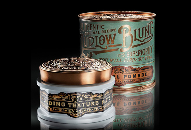
Great packaging shouldn’t stop at just the design itself. A huge part of effective packaging branding encompasses the materials, shapes, and textures used in order to create a complete unboxing experience. While vintage-inspired packaging has been around for a while, we are seeing this trend take on a new three-dimensional life in 2021. As such, you’re going to see much less generic vintage-inspired packaging and instead come across packaging designs that look so authentic you will think it’s been plucked out of a by-gone era.
You need only visit Brooklyn-based hairdressing salons Ludlow Blunt to feel like you’ve traveled back in time, and its products are no different. The brand has leveraged designs and textures on its packaging that are representative of the architecture of the original shopping mall in which it was built. The result is a really authentic way for customers to feel like they have a small part of the store, and brand, at home with them.

While great packaging design certainly helps products stand out on the shelves (virtually or physically) – it offers so much more than that for brands. Done well, it can place a newcomer among the beauty elite or further solidify the relationship between a stalwart and its diehard fans. With the industry never one to shy away from experimental creative work and bold statements, beauty aficionados are set to have some truly memorable brand experiences delivered directly to their doors in the coming months.