What differentiates a breakthrough product, brand, or marketing campaign in a marketplace awash with options and thousands of new launches every year?
The BeautyMatter Awards recognize the role of design and the brands and agencies that push the envelope, reimagining the boundaries with innovative design ideas and impeccable execution. From creating experiential sensorial playgrounds to conceptualizing bold visual concepts, design has the ability to explore a brand's values and bring them to life.
Every brand has a story and creatives use branding, strategy, production, architectural, experiential, and industrial design to tell it. The BeautyMatter Awards surface the very best of design, from packaging and branding to marketing campaigns and spatial design.
Dive into the work of the finalists in the BeautyMatter Awards design category.
Best Spatial Design: Recognizes unique concept, design, and execution of a physical space, such as a retail store, salon, or spa.
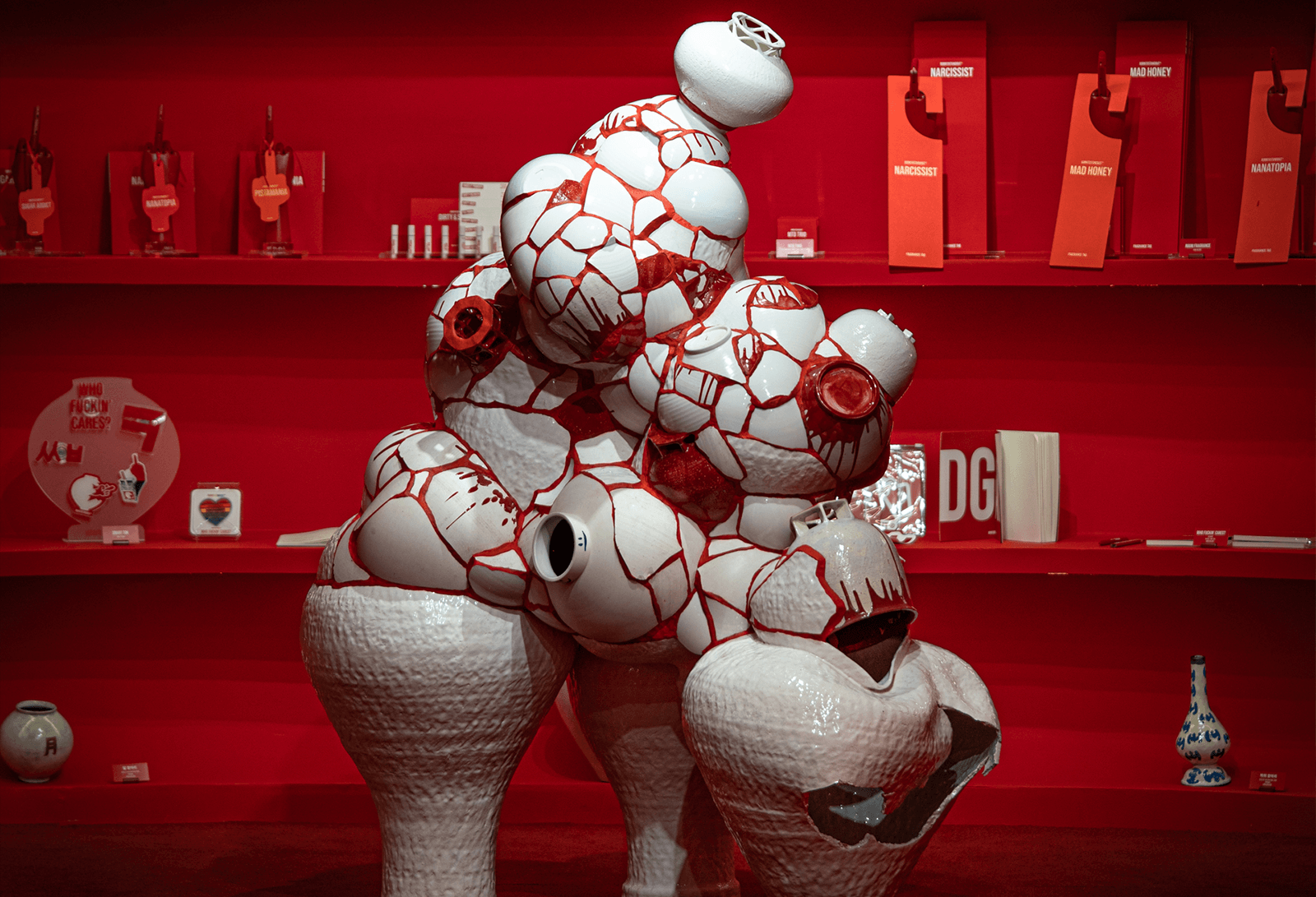
BORNTOSTANDOUT - The Hannam flagship store, known as “HOUSE OF CRIMSON,” is a bold fusion of contemporary artistry and Korean heritage. The space is immersed in an intense shade of crimson, symbolizing defiance, passion, and individuality. Avant-garde ceramic sculptures by Kang Minseong, Yeon Hokyung, and Park Hyunjun establish a dialogue between modern aesthetics and traditional Korean craftsmanship.
Formula Fig - The overarching design goal was to create an environment that is both warm and technically driven, like its facials. The spaces are made to be otherworldly in architecture and deeply experiential. At the heart of every Fig Bar is a unifying design theme: The Fig—an internal flower where what’s on the inside is what really counts. Velvety and green on the outside with a soft pink center, our communal spaces are outfitted in lush emerald hues, while every bathroom is a pop of pink.
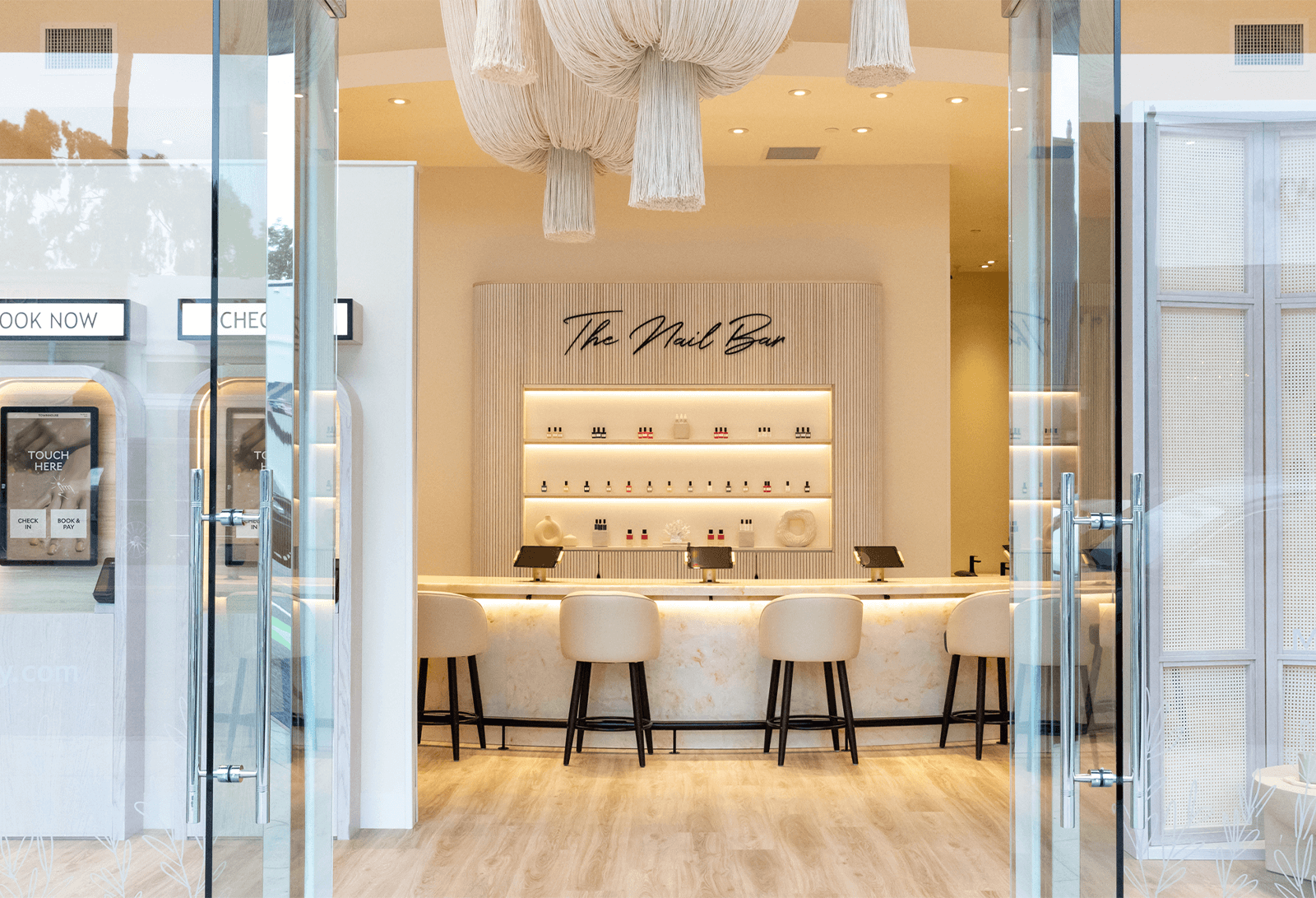
Townhouse - The design concept creates a sophisticated, tranquil environment that redefines the nail salon experience, moving away from the industry’s traditionally outdated spaces. More than just aesthetics, the sophisticated and tranquil environment reflects the brand’s core values of quality and exclusivity. By blending beauty with functionality, Townhouse ensures a seamless, elevated customer journey, solidifying its status as the go-to luxury nail destination.
Best Ad Campaign: Recognizes outstanding creativity, design, and execution in advertising campaigns across online and offline mediums.
Free The Birds x QMS Medicosmetics Brand Campaign - The creative work centered on establishing an iconic, ownable visual and verbal identity that could thrive across digital platforms, retail environments, and luxury spa settings. Free The Birds developed a compelling new design language, placing expert aestheticians at its heart to champion QMS’ clinical efficacy and credibility. Central to this was the creation of a new brand mantra, The Beautiful Truth, cutting through industry jargon with transparency and clarity.
Front Row x Amika Perk Up Ultra Campaign - The campaign launched Amika’s dry shampoo, Perk Up Ultra. The campaign clarified its unique formula, helping users identify which of the three dry shampoos best suited their hair needs. A fully integrated digital campaign spanned TikTok, Instagram, paid social, and YouTube, along with in-store visuals at Sephora and out-of-home placements across NYC subways and billboards.
Schwarzkopf “What Story Will You Tell?” Campaign - A celebration of confidence and empowerment through hair color, featuring actress and producer Sofia Vergara and celebrity hairstylist Chris Appleton as brand ambassadors. The campaign invited consumers to view hair color not just as a beauty choice but as a powerful way to tell their personal stories and embrace their individuality. A multiplatform campaign across Instagram, Facebook, and TikTok, featuring behind-the-scenes content, educational tutorials, and ambassador interviews was rolled out.
View Imaging x Laneige - Through an integrated approach, View Imaging delivered a diverse, cohesive asset library that authentically represented the Laniege customer base while stretching its budget across all required platforms and markets. By incorporating its post-production expertise into the pre-production planning phase, View Imaging helped Laneige optimize its deliverables while simultaneously enhancing its visual brand identity in the competitive US beauty market.
Best Brand Identity: Recognizes design, content, strategy, and execution tied to brand identity, website, packaging design, etc.; can be a business at any stage.
Vacation - Designed to transport consumers to a timeless, quintessential vacation state of mind: one that feels as relevant today as it would in the '80s and will decades from now. A key part of conveying this is the commitment to a pre-digital, analog aesthetic— from the cut out images to lighting choices, textures, and meticulously selected typefaces, the creative materials feel like they were pulled from a long-lost ad agency’s archives. Every single product exists within its own, fully realized brand world, complete with unique packaging, campaigns, and storytelling.
Saie - What ties Saie’s community together is a shared passion for sustainability. This comes to fruition through Saie’s iconic lilac branding and fully recyclable products. Saie is known for speaking up and showing out. Saie isn’t afraid to consistently raise the bar from the makeup industry in terms of sustainability and what Saie calls, “just doing the right thing.” When consumers purchase Saie, they know that they’re signing up to make an impact.
Benefit Cosmetics - The new graphic language is cheeky—literally. Inspired by Benefit’s origins as The Face Place and as a nod to the brand’s twin founders, its graphic shapes make up an endlessly adaptable set of cheeks, eyes, brows, and lips to configure a face, while also serving as a texture that creates a sense of place. They crafted a new logo by modernizing its letterforms while retaining its iconic and quirky brand equity. Then, they took it a step further making it more dynamic—the new logo can now abbreviate, reshuffle, and even wink. Pink is now more than a color swatch; it has presence, attitude, and a point of view.
SARELLY SARELLY - From packaging to product to content, SARELLY SARELLY is not just building a brand—it’s building a movement across borders. The brand embraces an over-the-top Latin energy and celebrates what makes it different—even if it looks like “nonsense” to others. The brand identity turns boldness into strategy, blending editorial-level design with street-smart irreverence and deep cultural relevance. Loud, clever, unapologetically Latin. And that’s exactly the point.
RUHVEDA - Built on a powerful blend of cultural storytelling, artisanal craftsmanship, and distinctive design rooted in South Asia, the brand weaves heritage into every detail. RUHVEDA reclaims space for maximalist Indian heritage—presented through a modern, intentional lens. It's not just creating aesthetic beauty—it's preserving cultural memory through design.
Best Product Collaboration: Recognizes unique partnerships or collaborations between any two or more brands, businesses, individuals, or organizations.
Isamaya Beauty x Conserving Beauty - The partnership materialized through an intensive 12-month, co-development process. The Hyaluronic Cleansing & Conditioning Cloths represent the successful materialization of a shared vision: creating innovative skincare solutions that serve the needs of professional artists while elevating industry standards for single-use products.
Joylux x Respin - Joylux, a global leader in innovative intimate wellness technology, and Respin, the visionary women’s midlife wellness brand founded by Halle Berry, have embarked on a strategic partnership to revolutionize the conversation around intimate health for 60 million peri/post-menopausal women worldwide.The partnership's tangible manifestation is the launch of two groundbreaking products: a meticulously formulated intimacy gel and a special edition of the award-winning vFit Plus device.
Naked Beauty x Modern Magic - A seamless fusion of luxury fragrance craftsmanship and digital influence, bringing together Modern Magic’s expertise in scent creation with Brooke DeVard’s highly engaged and loyal community. This partnership was born out of a shared vision to create a fragrance that embodies modern elegance, emotional connection, and authenticity. The result is an addictive blend of neroli, green tea, and sandalwood, with the added depth of ISO E Super, a scent molecule known for its ability to enhance wearability and longevity.
Maison Crivelli - The goal behind the collaboration with Jordi Fernández on Cuir Infrarouge was to create one of the most surprising leather-based fragrances on the market, inspired by a vivid personal adventure. The project stands out for its boldness, authenticity, and precision. What truly made it break through the noise is the instant alignment between an uncompromising creative vision and the technical excellence of one of the best perfumers of his generation.
Lush Cosmetics x Dylan Mulvaney - The brand partnered with trans actress and creator Dylan Mulvaney to launch the Late Bloomer Bath Bomb, a limited-edition product celebrating Mulvaney’s memoir, Paper Doll: Notes from a Late Bloomer. The collaboration highlights Lush’s commitment to LGBTQ+ advocacy, with 75% of the purchase price (minus taxes) supporting trans-led organizations. Mulvaney’s deep connection to Lush—beginning as a former shop employee at the Westfield UTC San Diego location—added an authentic, full-circle narrative that resonated with both Lush’s core customers and new audiences.