





While what’s inside matters in beauty and wellness, research shows that packaging directly influences purchasing decisions. The packaging makes the product, or the sale, more specific. Packaging is the direct link to the consumer, whether at the point of sale or online. Packaging can live without communication, but the opposite is not true, which is what makes it indispensable.
Packaging innovation has been the medium for some of the boldest design ideas, sparking conversation, attracting investment, and placing packaging beyond the supply chain and into cultural discourse.
This work sets new creative benchmarks by solving problems, not simply focusing on aesthetics for the sake of creating viral moments. Packaging serves to solve real-world problems, and true innovation rises to the occasion with solutions that make it easier to recycle, cheaper to produce, or smarter for a brand's business.
Sometimes, the most effective packaging isn't flashy but simply works for the brand, the consumer, and the world it inhabits. The finalists in the BeautyMatter Awards across the packaging design categories both solve problems and stop us in our tracks with creativity.
Best Product Packaging Design (Brands) recognizes unique concept and execution tied to packaging design, including concept, componentry, material selection, and decoration for a finished product; can be a new-to-market brand or relaunch.
Clean Beauty Collective Hair & Body Perfume Mist Collection by JMD Creative – Body mists have become a playground for design, where form matters as much as fragrance. Clean Beauty Collective tapped JMD to create something that leveraged the trend while pushing it forward. The design reimagines the body mist as a sensorial object, translating scent into shape, color, and emotion, resulting in a design as vibrant as the nostalgic popsicle-inspired forms. Elongated silhouettes echo the familiar simplicity of a popsicle stick—playful yet graphic—while translucent, juicy colorways bring each fragrance to life. The format is instantly recognizable, designed to spark curiosity on shelf and invite interaction in hand.
Eilish Fragrances by Parlux – The concept behind Your Turn Eau de Parfum is rooted in Billie Eilish’s vision of fragrance bottles as collectible sculptural objects that function as art pieces in their own right. The design draws from Eilish’s fascination with dice, reimagining a pair of stacked dice as a modern, dimensional sculpture. Inspired by a set of heavy brass dice she owns, the bottle translates this reference into a polished, translucent chrome object that balances playfulness with edge. The stacked configuration evolved through an iterative design process, refining proportion, weight, and symmetry to create a silhouette that feels intentional, iconic, and display-worthy.
Kissylips Cushy Shine Lip + Cheek Balm by Fel Beauty – Packaging developed to recreate the experience of an unforgettable kiss through product form. A truly first-of-its-kind balm format with a lip-shaped applicator where you "kiss-on" the product formula. Beyond inspiring nostalgia and emotional connection, the intention was to create a design that applies perfectly and effortlessly without requiring fingertip application or a mirror. The package uses FSC-recycled paper for the secondary packaging and a mono-material (post-consumer recycled plastic) primary color-matched to every shade to guide the consumer journey.
Yes Day by Bartlett Brands – Created for a consumer caught between harsh adult skincare and juvenile “kids” products that feel cringe. The strategy is centered on creating a collectible, shelfie-worthy packaging that feels aspirational and instantly recognizable while maintaining trust. The design needed to perform socially (GRWMs, shelfies, hauls) and emotionally, serving as a teen’s first positive relationship with skincare. Yes Day’s packaging design has translated into meaningful traction across social, experiential, and retail channels.
Odele Hair + Body Mist – For the brand’s expansion into fragrance, it defined the design and packaging vision through two guiding principles: elevated and timeless, delivered at an accessible price point. At its core is a refined glass bottle with superior clarity, chosen to elevate the product’s presence on counter while eliminating the need for secondary components—reducing waste without compromising on experience. The clean, cylindrical glass bottle aligns with the existing Odele lineup, creating visual consistency. The rounded, shiny black ball cap was selected to bring a soft elegance to the package, nodding to classic fragrance design while giving a wink of playfulness and a current, unfussy look.
Best Sustainable Packaging Design (Brands) recognizes unique concept and execution tied to packaging design that address the full life cycle of the product, carbon footprint, and material selection/reduction; can be a new-to-market brand or relaunch.
KraveBeauty – Designed through a “less but better” lens, where form, function, materiality, and decoration are intentionally simplified to reduce environmental impact while improving user experience. Together, these decisions reflect a design philosophy centered on efficiency, material responsibility, and usability—creating packaging that is simple and structurally and environmentally considered. The brand addresses the full product life cycle by treating packaging and formulation as a single, waste-reducing ecosystem. Material selection minimizes virgin plastic through high-percentage PCR components and a plastic-neutral footprint. It also prioritizes material reduction through jumbo sizes of bestsellers and refill systems.
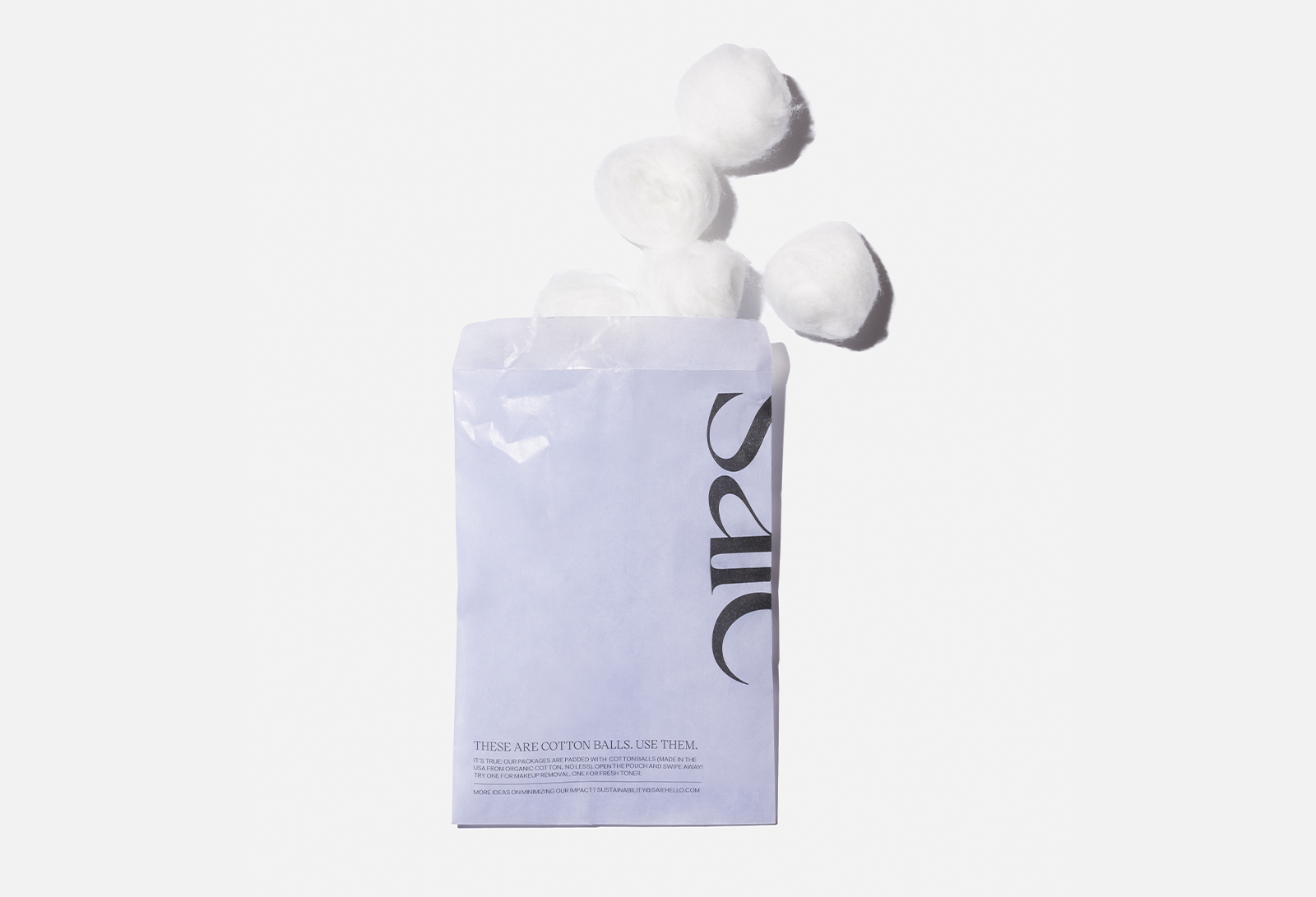
Saie – The design brief for Saie’s packaging is centered on "The Saie Way": a commitment to ensuring that clean, sustainable formulas are never undermined by wasteful or unmindful shipping and secondary materials. The concept treats every layer of the consumer experience as an opportunity for climate action. The goal was to create a design ecosystem where reducing, reusing, and recovering are as effortless as applying the makeup itself. Secondary packaging consists of 100% recycled FSC-certified paper cartons, manufactured in a carbon-neutral facility. The primary components utilize a high percentage of post-consumer recycled (PCR) plastic (63.87% by weight), significantly reducing the need for virgin plastic.
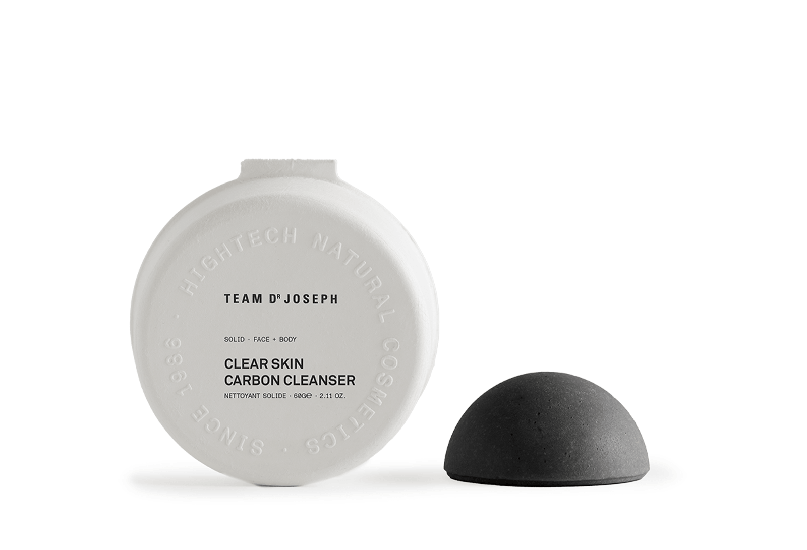
Team Dr Joseph - The impact of the Clear Skin Carbon Cleanser packaging begins with a fundamental design choice: reducing packaging by redesigning the product itself. Developing the cleanser as a solid formula significantly reduces material consumption, packaging volume, and transportation weight. The packaging itself is intentionally minimal and functional. Made from 100% recycled paper, it is FSC-certified, completely plastic-free, and fully recyclable. By relying on a mono-material paper solution, the packaging can easily reenter existing recycling streams, supporting a more efficient circular economy.
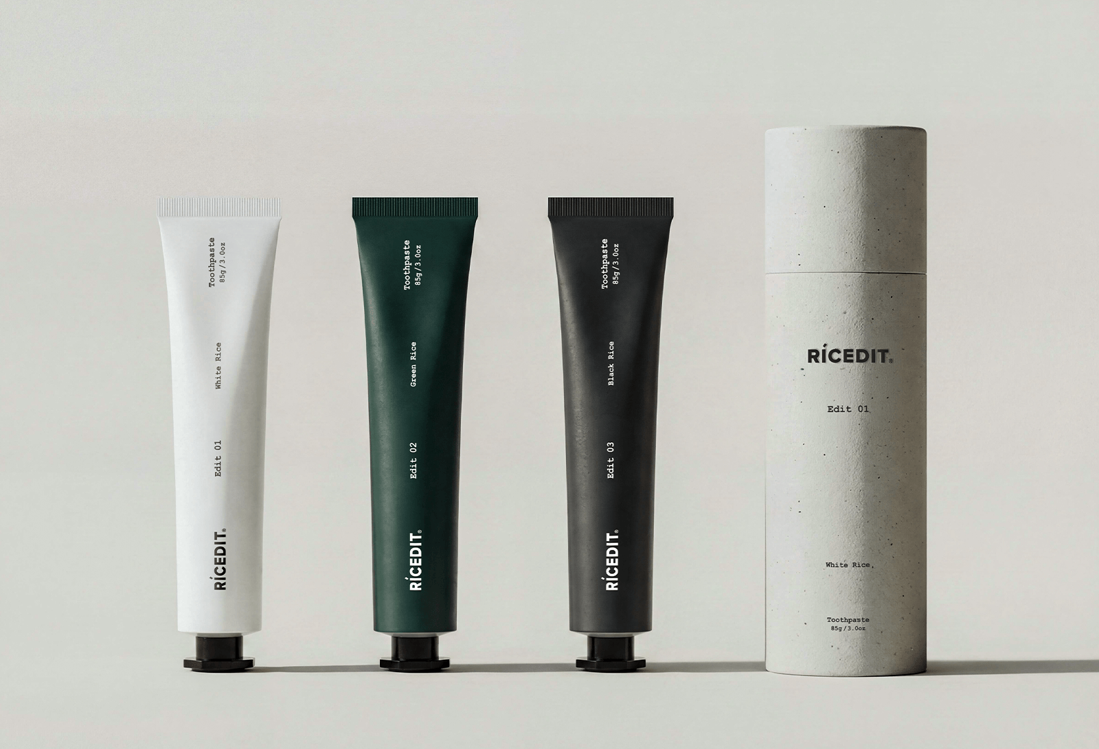
RICEDIT - The package design is defined by material, not applied onto it. A minimal elongated tube sits inside a rigid cylindrical paper structure. The cylinder handles protection, storage, and long-term reuse. The weighted paper form provides a grounded, intentional presence:It stays where you put it. Material selection is deliberate and restrained. The outer cylinder uses FSC-certified paper—no lamination and no coating, printed with soy-based ink to reduce VOC emissions and allow direct recycling without material separation. The tube and cap are produced from PE resin with approximately 35% post-consumer recycled content, calibrated for safety in oral-contact applications. All components work within existing municipal recycling systems. No proprietary disposal is required.